


OCT 8 | 3:00 PM

Porta la tua asta ai collezionisti di tutto il mondo!
Pubblica oraIscrivendoti, accetti la politica sulla privacy. Annulla l'iscrizione in qualsiasi momento.
Barnebys HQ
Brahegatan 10
BOX 5038
114 37 Stockholm
Tutte le aste / Arte, Pittura e Arti Grafiche / Josef Albers (1888-1976) - Interaction of Colors - XIII-1

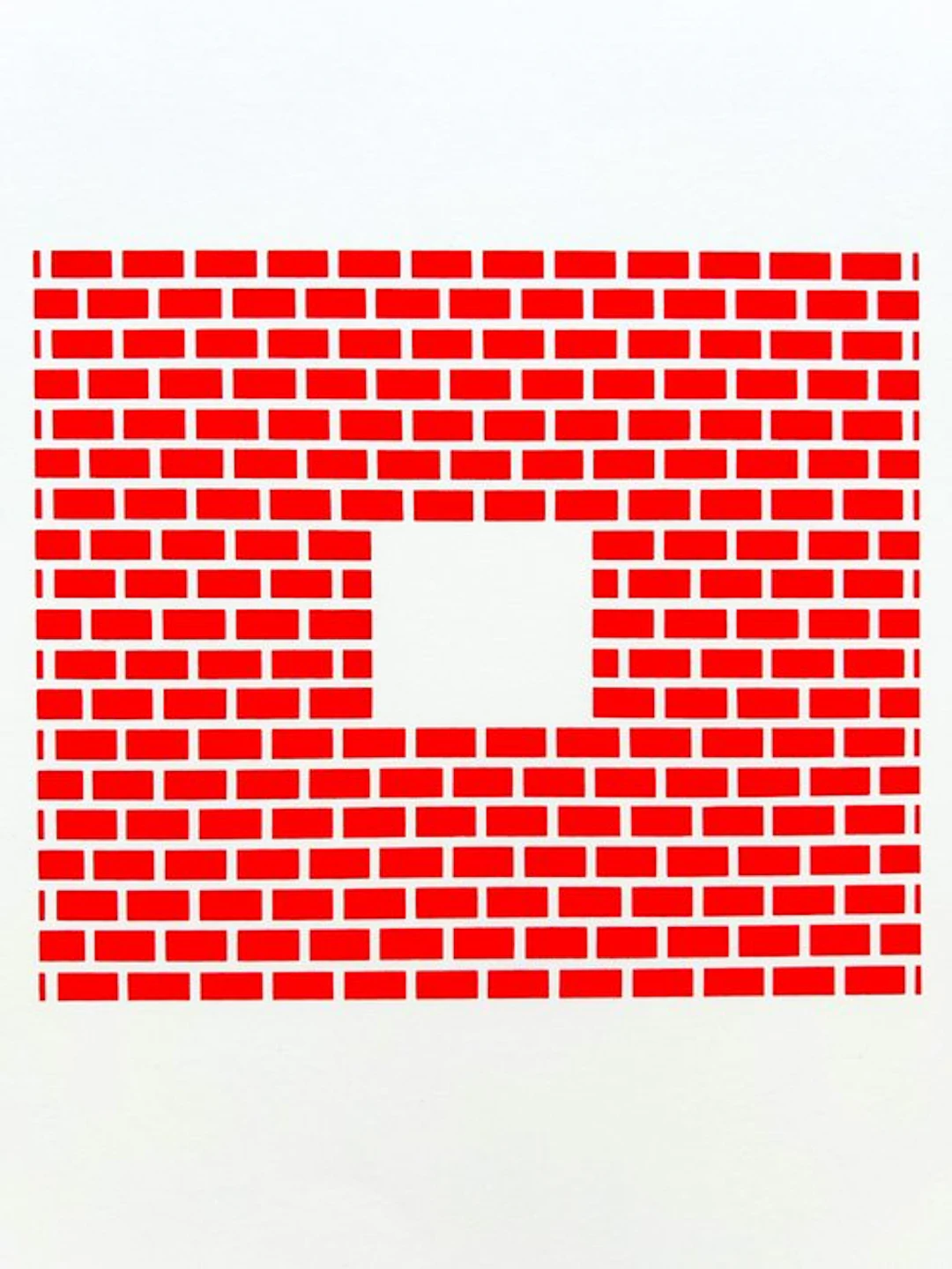
Single-page screenprint by German-American artist Josef Albers (1888 Bottrop - 1976 New Haven, CT), from his portfolio 'Interaction of Color' (1973), published by Josef Keller Verlag, Starnberg (ed.) on the kinship and influence of colors on themselves and on each other. Characteristics: - From the portfolio 'Interaction of Color' (1973) - Serial number: XIII-1 - 25 x 33 cm - Excellent condition (see photos, which are part of the description) - not signed, unnumbered - portfolio name and serial number on the back of the screenprint - one screenprint of the 1000 editions - handmade paper - Provenance: from the original portfolio 'Interaction of Color' and purchased at a recognized/reputable art auction (Germany) (!) Last page (in the photo) not included. This back contains only a pencil monogram of the title (no printed text). Additional information about Josef Albers: Josef Albers (1888–1976) was an influential German-American artist, designer, and art educator, best known for his groundbreaking work on color and perception. He began his career as a teacher at the Bauhaus in Germany, where he lectured in glassmaking, design, and visual theory. After the Bauhaus was closed by the Nazi regime, Albers emigrated to the United States in 1933. In America he became a key figure in modern art and art education. He taught at Black Mountain College and later at Yale University, where he influenced an entire generation of artists and designers. Albers believed that color is relative and dependent on its surroundings—a idea he studied systematically in his art and teaching. His best-known work is the series Homage to the Square (1950–1976), in which he explored the interaction and illusions of color with simple geometric forms and carefully chosen colors. In addition to painting, Albers also worked in graphics, photography, and furniture design. His theoretical book Interaction of Color (1963) remains a standard work in art and design education worldwide. Josef Albers is regarded as a key figure in the transition from European modernism to postwar American abstract art. Josef Albers’ Interaction of Color is not a traditional color theory with fixed laws or schemes, but a fundamental investigation into how color is perceived. For Albers, color did not exist as an objective given: color is always relative and changes depending on its context. His central belief was that color “is almost never what it seems.” Instead of explaining colors through physics or color wheels, Albers started from the experience of looking itself. He found that color can only be truly understood through observation and experimentation. Therefore he did not have his students paint, but work with colored paper: cutting, shifting, and comparing. The eye had to be trained, not memory. A core idea in Interaction of Color is that colors continually influence each other. When two colors sit next to each other, they change each other’s appearance. This principle of simultaneous contrast means that the same color can appear lighter, darker, warmer, or cooler depending on the context. Thus a neutral gray can look cool beside red and warm beside blue, without the gray itself changing. Albers also demonstrated how color can deceive the eye. Two different colors can appear identical, while one color can appear as two different colors. These visual illusions were not tricks for him, but proofs of how unreliable our perception can be. Color is not a fixed fact, but an event that arises in the relationship between colors. Additionally, he explored how color can suggest transparency and spatiality on a completely flat surface. Through careful color choices, a form can appear to lie in front of or behind another, or a transparent effect can arise without true transparency. This insight became especially influential in abstract art, graphic design, and architecture. Constraint played a crucial role in Albers’ method. By using fixed shapes and simple compositions—such as in his famous series Homage to the Square—he directed all attention to the interaction between colors. Form was subordinated to perception. The book Interaction of Color, published in 1963, is composed of exercises, examples, and observations. It is not a theoretical manual, but a practical learning tool that invites readers to look and discover for themselves. Its influence extends to today, from painting and graphic design to fashion, interior design, architecture, and digital interfaces. Albers’ enduring message is simple but radical: color is the most relative medium in art. Those who work with color work not with certainties, but with perception, context, and experience. Albers was related to the following artists: Paul Klee, Wassily Kandinsky, László Moholy-Nagy, Johannes Itten, Oskar Schlemmer, Theo van Doesburg, Piet Mondrian, Kazimir Malevich, Anni Albers, John Cage, Robert Rauschenberg, Cy Twombly, Ellsworth Kelly, Frank Stella, Agnes Martin, Ad Reinhardt, Victor Vasarely, Bridget Riley, Sol LeWitt, Max Bill.
Stima:€150
Vai all’astaVedi tutti gli oggetti diCatawikioArte, Pittura e Arti Grafiche
Stima:
€150
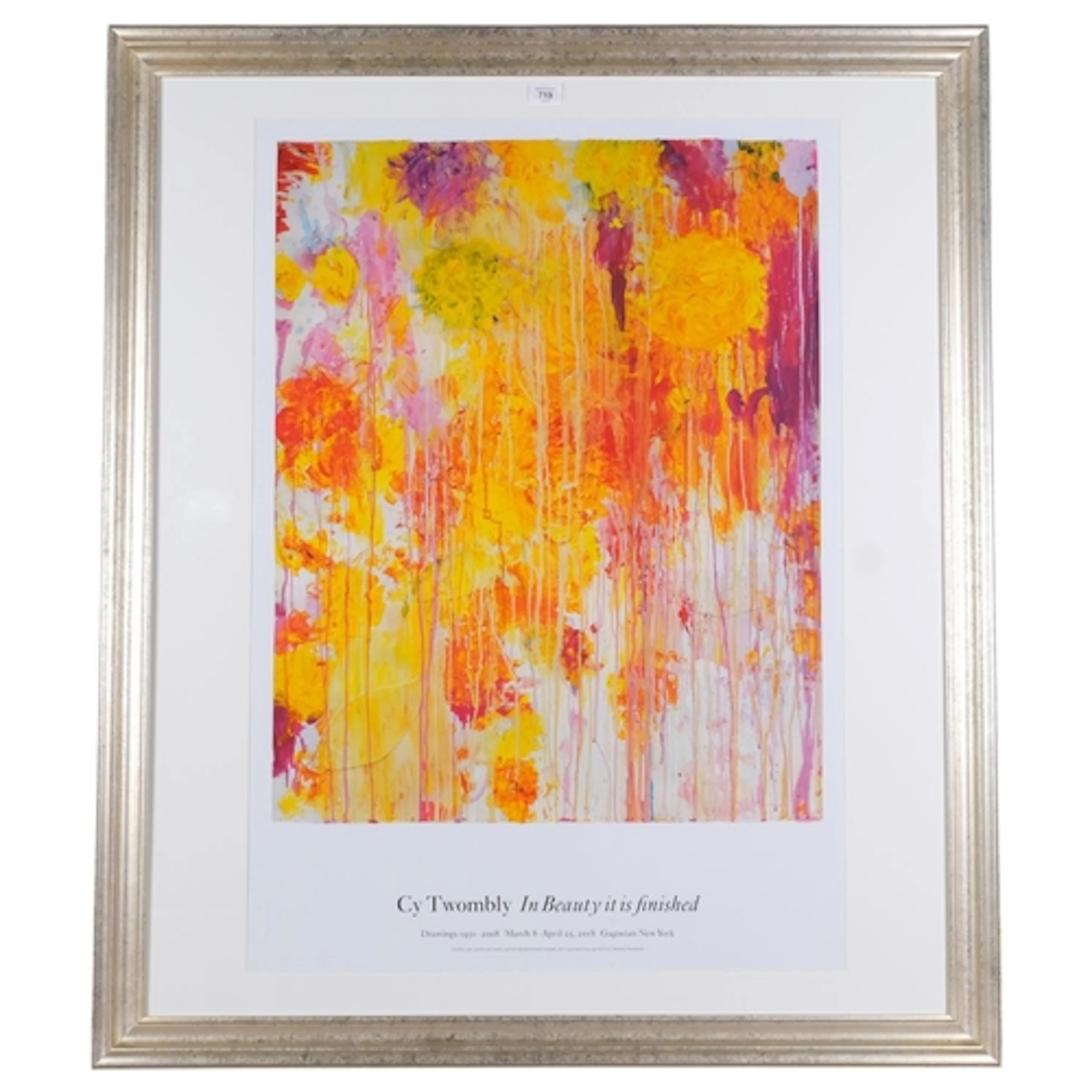
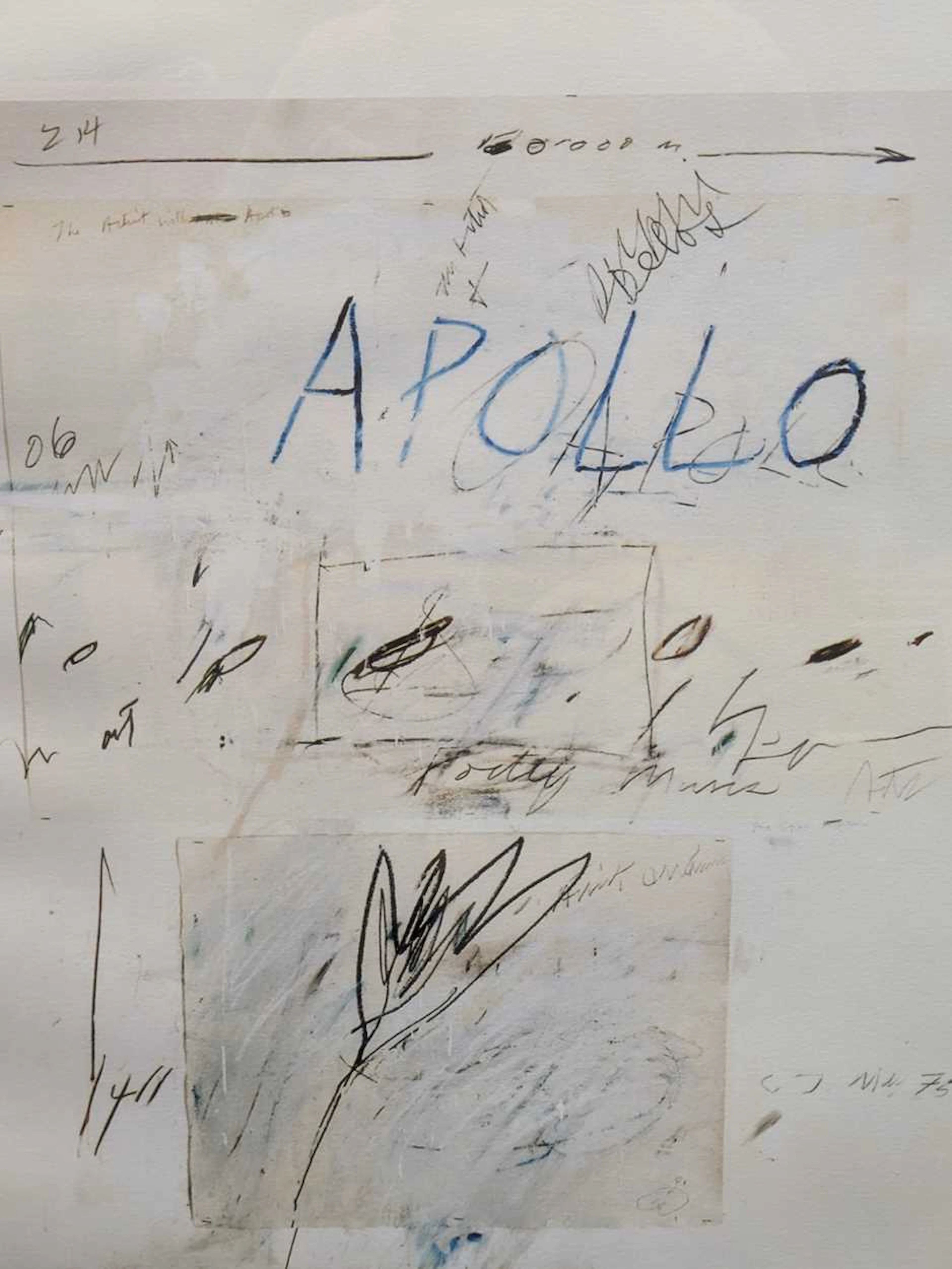
Cy Twombly, original exhibition poster print, In Beauty It I...
08/27/2026

€175.23
Stima: €234.03
OCT 8 | 3:00 PM
Porta la tua asta ai collezionisti di tutto il mondo!
Pubblica ora€150
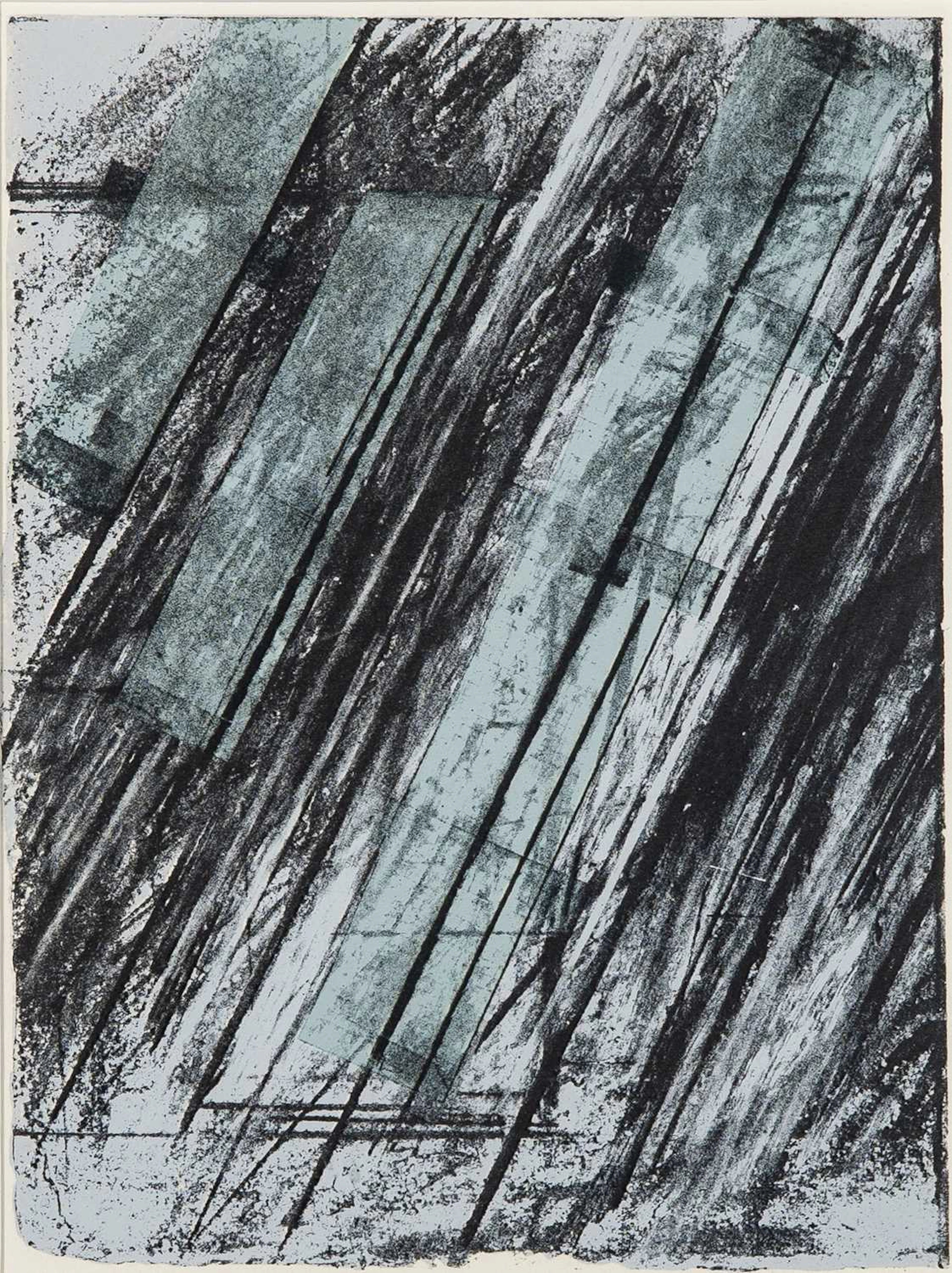
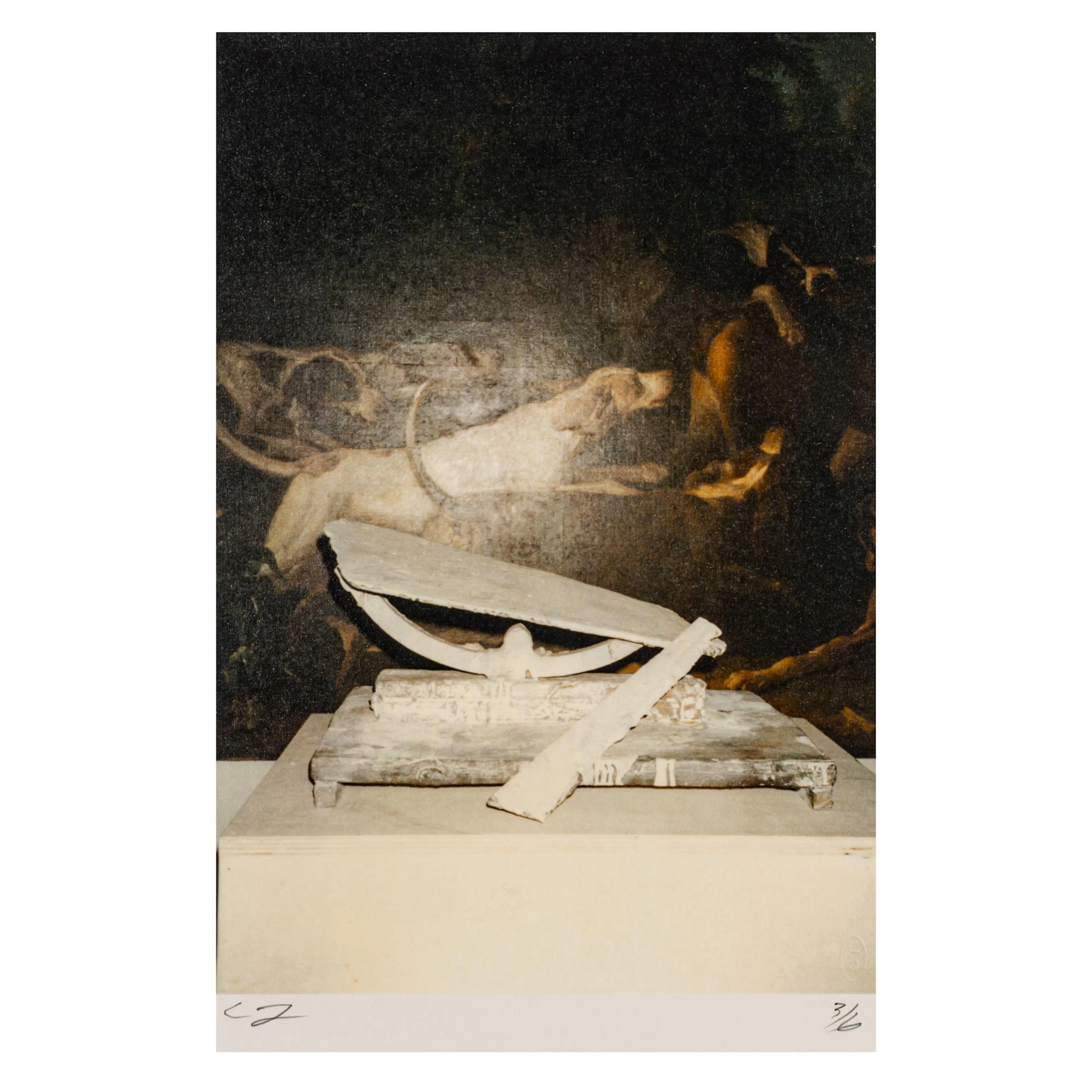
Cy Twombly (1928 Lexington, VA - 2011 Rom) 'Painting Detail and “By
04/24/2026

€5,500
Stima: €5,500